Rebrand Announcement

Original Brand
At The Evoke Group, we embrace change and understand that it is part of life. That being said, this change isn’t just for the sake of change. This brand refresh represents the internal improvements we’ve made and the direction this company is headed moving forward.
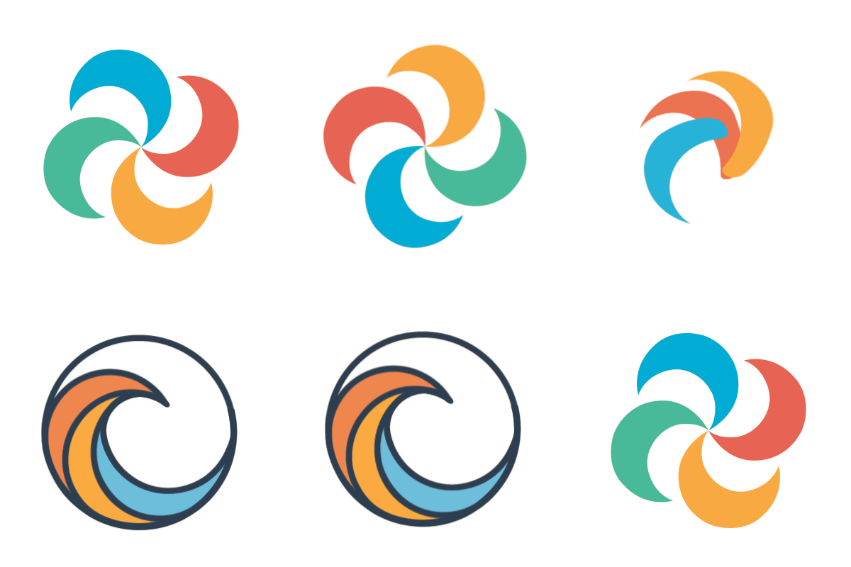
The original logo was created with the launch of the company in 2014. The logo swirl was fun, playful, and its energetic feel represented the media production house that was The Evoke Group at the time.
- The mark existing within the company name reduced scalability.
- Multiple colors demanded a background extreme enough to create contrast for all five colors.
- The symbol, while fun, lacked a deeper meaning to our business, which diminished recall ability for consumers.

A New Wave


This new logo utilizes the basic shapes of the original mark to form the curvature of a wave.
A wave is a force of nature that cannot be stopped.
In relation to marketing, the wave symbolizes the impact that rapid technological development has on society. While most people choose to ignore or even fear the unknown, we embrace it.

We’re excited where this new look will take us, and we hope you follow along.
Love,
The Evoke Group
TL;DR: We changed our logo, and it is dope.
505 Fay St. #204
Columbia, MO 65201 The Evoke Group - Denver, CO
1415 Park Ave. W 2nd Floor
Denver, CO 80205

